Designing Shift — A Career Transition Platform
01 · Context
Helping professionals navigate career change with clarity.
Career transitions are complex and unstructured. Most professionals juggle 5+ platforms — job boards, resume tools, interview prep apps — with no single guide helping them understand where they are, what they're missing, and what to do next. Shift was designed to solve that.
02 · The Problem
Career switchers are lost between too many tools.
Users struggle to understand how their existing skills translate to new roles. Job search, resume building, and interview preparation are scattered across different platforms. This creates confusion, decision fatigue, and a lack of confidence throughout the journey.
Career transition is not a single action — it's a journey. Users need guidance, not just tools.
03 · Research
Understanding the real friction points.
Conducted both primary and secondary research to understand existing behaviors and pain points.
Secondary Research Insights
Competitor Analysis
Analyzed LinkedIn, Indeed, Canva Resume, Resume.io. Gap identified: none offered a guided end-to-end transition experience.
04 · Define
Framing the problem with a user-centric lens.
Career switchers lack a structured and guided approach to navigate the transition process. Existing solutions are fragmented, making it difficult for users to understand their path, position themselves effectively, and confidently apply for relevant roles.
Surya, The Aspiring UX Designer
“I don't mind starting fresh, but I don't want to start from zero again.”
- Background
- Software engineer transitioning into UX design. Strong technical skills but struggles to position himself for UX roles.
- Goals
- Translate technical skills to UX terminology, build portfolio, land Junior UX role.
- Pain Points
- Difficulty articulating transferable skills, imposter syndrome, lack of clear career path mapping.
Key Insights
- Career transition is a journey, not a single step.
- Users need guidance, not just tools.
- Fragmentation leads to confusion and drop-offs.
- Confidence plays a key role in decision-making.
- Personalized experiences improve trust and engagement.
05 · Ideate
Translating insights into structured solutions.
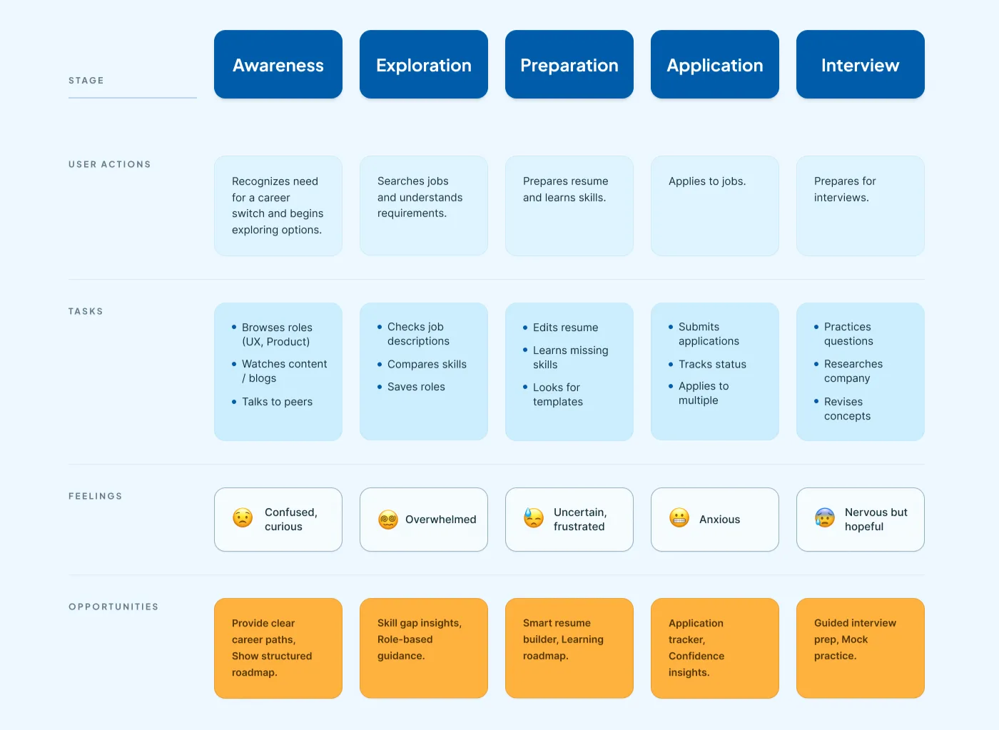 USER JOURNEY MAP — job search, recommended roles and salary range surfaced up front
Key Product Directions
06 · Prototype
From sketches to screens.
- Paper Sketches — quick explorations of layout and flows
- Low-Fidelity Wireframes — structure and hierarchy, reducing friction
- High-Fidelity Designs — clean minimal visual system, reduced cognitive load
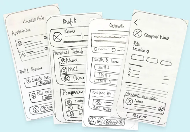 SKETCHES → WIREFRAMES → HI-FI — job details, from skills match to a one-tap apply
07 · Visual Design
A system built for clarity and calm.
Soft color gradients, rounded cards, and clear visual hierarchy create a calm experience that allows users to focus on career progress without feeling overwhelmed.
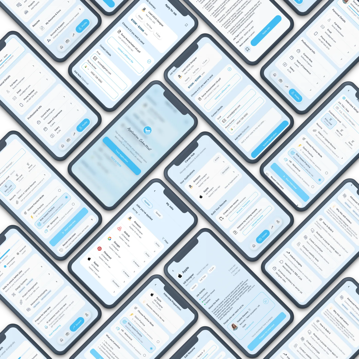 DESIGN SYSTEM / UI KIT — resume templates, styled to match the calm, rounded system
08 · Testing
Validating with real users.
The app felt intuitive and polished. Very clear roadmap for career shifting.
09 · Reflection
What I'd do differently.
This project taught me that career transition tools need to prioritize emotional confidence as much as functional utility. The biggest lesson — fragmentation isn't just a UX problem, it's an emotional one. Users don't just need tools consolidated; they need to feel guided.